
Are you retina ready?
Design standards are evolving rapidly with the release of new mobile, tablet and desktop devices. Designers have to consider how their sites will appear on myriad different devices of varying screen resolutions and aspect ratios. The most significant recent development in this area being the introduction of Apple’s Retina display, released on the iPhone 4 in 2010.
Until now, this has only had implications for designers of iPhone graphics, however, with the recent announcement and release of the retina Macbook pro, it is now
a feature across all product categories.
A brief explanation how the retina display works:
On a retina display, there are four times as many pixels on the same physical surface of a screen. For photographs, which consist of bitmap pixels (which cannot be divided down to any smaller unit), this has the effect of multiplying the image causing it to lose detail along the way:
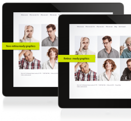
What it means:
There are many challenges and constraints of designing for multiple density displays but thankfully, even though we are in the early stages of this shift, several approaches to optimising web graphics for retina displays have sprung up.
And so when we are creating websites now we generate all graphics double their normal size. The issue with this is that non retina displays have to download large assets which can make them slow. To negate this issue, we used CSS to divide the image size in half, serving the small images to non – retina devices and double density images to retina display. Using javascript, we can detect the device being used to browse and serve the graphics accordingly.
Apple’s worldwide market currently stands at 8.7% with research showing that Mac OS is most popular amongst higher income demographics. With the introduction of Retina display, Apple are paving the way for the next set of design standards
to which websites must adhere or risk being left behind as Apple’s innovations are increasingly adopted by other operating systems until they become widespread.